Wednesday, May 2, 2012
Progress
All images courtesy of http://www.apartmenttherapy.com/
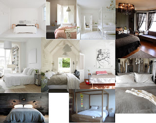
That, that is my mood board for our re-decoration of the main bedroom. I've been toying with the idea for months of doing a brightly coloured room ... but I keep coming back to the simple and neutral shades. Maybe I'm better to leave the colours for the guest room?
The biggest question of all is the bed. I'm in LOVE with the four poster on the bottom. But, here's the clincher. It's 220cm long. Our bedroom is 280cm wide. That leaves a meesly 50cm to walk around it and to fit a TV in (AND, because it's just our luck ... there's no studs to support wall mounting the TV. I toyed with the idea of kicking the TV out of the bedroom (but I've been overruled) and our only other option is to move into what is now the guest room ... but it's right next to the front door and furthest from the bathroom. Hmmm ....
Otherwise, I stick with one of the beds I've previously posted about (or something similar). Simple. Classic. Perhaps I need to accept that a four poster isn't made for our house.
I never thought decorating would be this hard!
Subscribe to:
Post Comments (Atom)

Good luck with the makeover- some beautiful inspiration here.
ReplyDeletex
Michelle
www.michellesstylefile.com
I am all for the white and simple bedrooms!
ReplyDeleteI didn't even measure our bed when we bought it, or our room so this could be interesting.
I'm going for a black and white (but mostly white) guest room at the moment. The work in progress is looking quite nice. I'll hopefully be able to post some finished photos soon.
DeleteOur bedroom is quite an odd shape - I'm sure your new bed will be fine!
I would love a giant four poster bed too but would need a much larger room for it to be practical! Good luck with your redecorating x Sushi
ReplyDelete