Wednesday, May 2, 2012
Progress
All images courtesy of http://www.apartmenttherapy.com/
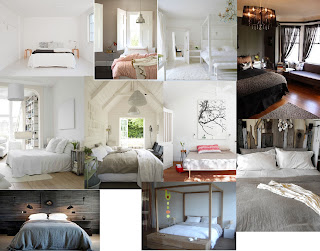
That, that is my mood board for our re-decoration of the main bedroom. I've been toying with the idea for months of doing a brightly coloured room ... but I keep coming back to the simple and neutral shades. Maybe I'm better to leave the colours for the guest room?
The biggest question of all is the bed. I'm in LOVE with the four poster on the bottom. But, here's the clincher. It's 220cm long. Our bedroom is 280cm wide. That leaves a meesly 50cm to walk around it and to fit a TV in (AND, because it's just our luck ... there's no studs to support wall mounting the TV. I toyed with the idea of kicking the TV out of the bedroom (but I've been overruled) and our only other option is to move into what is now the guest room ... but it's right next to the front door and furthest from the bathroom. Hmmm ....
Otherwise, I stick with one of the beds I've previously posted about (or something similar). Simple. Classic. Perhaps I need to accept that a four poster isn't made for our house.
I never thought decorating would be this hard!
Subscribe to:
Comments (Atom)
